
In the past we’ve used data loggers to record temperatures at ten minute intervals, due to research that suggested that blackcurrants require a certain number of hours each winter, at which temperatures are between a certain range, to ‘set’ the fruit buds for flowering in the spring.
While a working farm is far from a controlled laboratory situation, and there were several potentially confounding factors in play, we certainly did see a suggestive correlation between warmer winters and poorer yields.
I’ve spent a lot of time walking around in the middle of the night at two to four-hourly intervals in summer, checking irrigation. That may mean going to bed at 11pm, being up at 1am, 4am, and 6am, for example. I’ve been doing that for the most part of the last 20 years or so (which is probably why I look closer to 50 at the age of 42). As a general rule, based on these experiences, it’s chilly at 2am in Tasmania even in summer. But this season it struck me that it was still disturbingly warm overnight – such that I’d be wearing just shirt sleeves instead of the usual multiple layers.
I started thinking about this, and those data loggers, in light of the spate of recent ‘hottest [insert month name here] on record’ headlines, and went to look a the Bureau of Meteorology data. I was a bit disturbed by what I saw, but more in terms of what I suspected that what I didn’t see might mean, so I contacted the BoM to ask whether my understanding of the data was correct.
What was troubling me is that the BoM only seemed to be listing four data items for daily temperatures: maximum temperature, minimum temperature, temperature at 9am and temperature at 3pm. If the monthly averages are only based on these readings, this strikes me as potentially very problematic.
And it turns out that it’s actually worse than that – only the minimum and maximum daily readings are used, and the average of these gives the average monthly temperature.
On this basis it seems likely to me that even the “hottest [month name] on record” announcements are potentially grossly understating just how much warming we’re experiencing. With the data loggers we used to capture temperatures every 10 minutes, we could draw a reasonably detailed graph of just what happened in a day, and there were quite a few fluctuations. By just using a minimum and maximum, the data could be quite unrepresentative, especially in cases where temperatures are tending to be at one extreme for longer – for example, as I believe we’re now experiencing, if the days are warmer for significantly longer (as in when it’s still shirt weather past midnight, and when you get out of bed at daybreak and it’s still disturbingly warm).
As an example, consider a Monday with a minimum of 5 degrees and a maximum of 17. That gives an average temperature of 11 degrees. Consider a Tuesday, also with a minium of 5 degree and a maximum of 17. This is again an average temperature of 11 degrees. But what if the temperature for that day was actually in the hotter part of that range, for a longer time – that would shift the average to be significantly higher. Expressed as a graph we could see something like this, where the blue area, in simplest terms, is the amount of heat over a day:

Note that both the above graphs for Monday are showing the same thing – an average temperature of 11 degrees, with the first graph showing half the day at 5 degrees and half the day at 17 degrees, representative of what an average of the min and max temperatures effectively assumes. The second graph draws the average in at 11 degrees across the whole day – with the resulting blue area being the same for both graphs.
Then, for Tuesday:

With a more granular set of data (in this case readings taken every hour), we can see that the temperature was not evenly distributed – the day spent more time being hot than it did being cold. The graph on the left shows the actual temperature distribution while the graph on the right shows the average of that distribution as calculated on the granular data.
The short story here is that on such a scenario, we’d be under-reporting the average temperature by a whopping (in climate terms) 2 degrees. Just for giggles, I might get out those data loggers and compare the derived average temperatures based on the average of minimum and maximum, and the average as determined over a more granular set of readings.
As for why the BoM does it this way, it’s (as I suspected) a legacy of the way data was obtained in the past. And it’s not just Australia that is calculating average monthly temperatures this way: “this way may not be the most representative of how warm or cold it is and for how long (especially these days with more frequent weather observations), but this practice has been standardised by the World Meteorological Organisation (WMO). This is because early temperature records are typically only the daily maximum and minimum temperatures, with higher frequency observations not made or archive[d]. So using the average of the maximum and minimum temperature readings provides a longer period of record, increases the number of sites that can be used (there are more sites with just maximum and minimum temperature observations) and so allows for a standard comparison to be made both temporally and spatially.”
While I can understand the reasoning, it seems to be a pretty significant flaw in the way we’re capturing this data. If the climate is indeed changing so that it’s warmer for longer, each day, then part of that increase is effectively going “under the radar”.
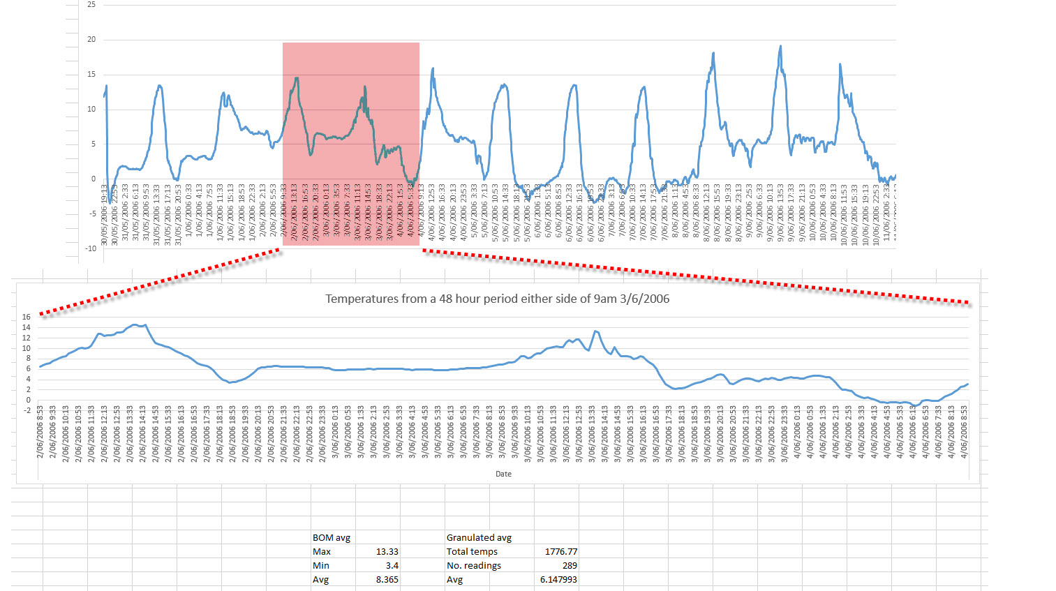
Update: I’ve been told that the BoM max is calculated from the 24 hour period after 9am and the minimum is from the 24 hour period prior to 9am. So I’ve jut pulled out some actual data logger data from the farm to see what I could see. The data is from ten years ago, in winter. As I see it (for a day that I’ve cherry picked as being demonstrative of the problem I’m speaking of), this is demonstrating that the calculated average from the BoM’s min/max approach is actually 2 degrees warmer than the average calculated from the more granulated 10 minute readings our data loggers produce. So it’s actually demonstrating the opposite of my concern – it’s actually cooler rather than warmer – but this is from winter, ten years ago, and unless I’ve missed something (which is entirely possible – I’ve already stuffed up the calculations a couple of times) this certainly shows that the daily average can be significantly skewed – based on actual data. I’ll be setting up the loggers over summer to test how it works out over the hotter months.
Great work Marshall..scary but
I shall be watching with interest, M.
My Dad logged temps for as long as I can remember to prove (to himself) the effectiveness of his “illegal” solar hot water heater (in the late ’60s the Hydro would add a surcharge if you were producing your own hot water).