Tools
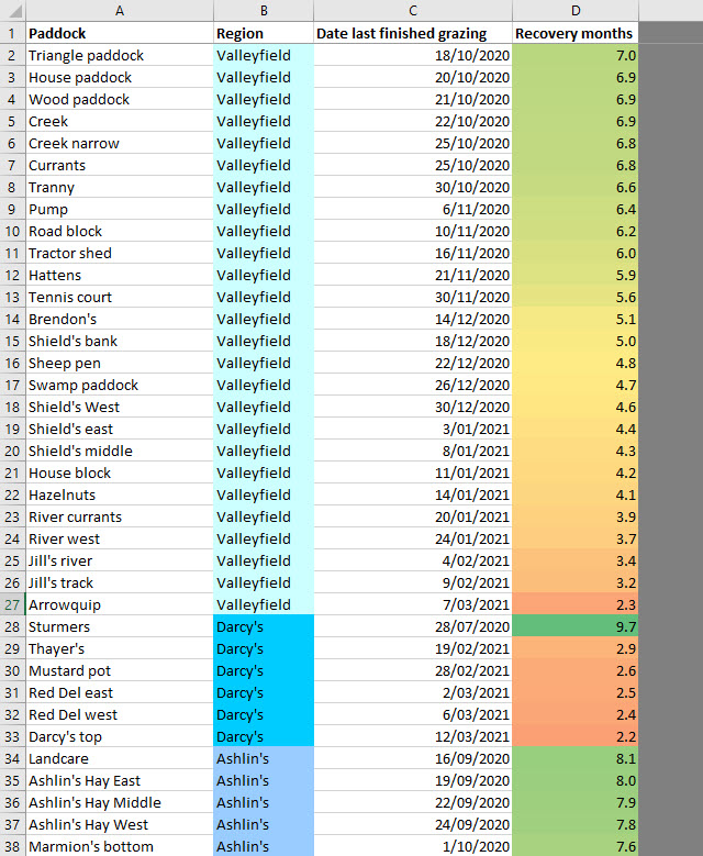
Grazing recovery heatmap
In May 2021 I gave a talk at a Regenerative Agriculture Network of Tasmania (RANT) dinner, and covered some of the tools I use. That includes a few spreadsheets and so on, including a grazing recovery heatmap which I love for a quick visual summary of how my paddocks are going, in terms of time recovered, and I thought I’d offer it here for anyone who wants to use it.
My own copy was rather quick and dirty, but I’ve tidied this up a bit to make it a bit user-definable for other folks to make it useful for their own patch. It’s still quick’n’dirty, though, and is offered as is, free of charge, with no warranty etc.
The idea is you define (optionally) your farm’s broad regions, then paddocks which can be assigned to those regions, and then when you enter your cattle moves out of each paddock, you can refresh the spreadsheet and you’ll get a colour-coded “heatmap” showing your most recovered areas down to your least recovered areas, by region. It’s not literally a map, it’s just a list, but I find it a very useful tool visually. No doubt grazing management software does a much classier job than this (at least I hope so), but it’s a good little freebie to get you started.
The link to the zip file below includes a blank copy of the Excel file, and a copy of the same file with some example data in it, which you can use to test the buttons and see what happens. Brief instructions are included in the sheets themselves. You’ll need to enable macros to use it.
I don’t intend to maintain this at all, but if anyone finds something startlingly wrong (which is quite possible – I’ve tested it for about ten minutes!!) or has a simple request that would make a huge improvement, I’ll consider it.
Also, feel free to distribute, alter, fork, whatever… but play fair – don’t charge any more for it than what you paid me 🙂